AS Graphic Design - Final Pieces
For my first year of Graphic Design I rebranded Innocent Smoothies. I created a logo, bottle cap designs, bottle labels and website designs. I decided to characterise the brand as fun, fresh and family-friendly, which, in turn, led me to create colourful, bold, fruit designs.
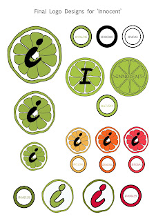
The first page shows my final logo designs and the variations I used. For example, I used green, yellow, orange and pink shades for the logo designs as, when they're on the product, they correspond to the flavour of the smoothie!
This second page is my final label and bottle cap designs. I created the fruit patterns by painting onto plain pieces of paper, using different painting techniques and materials to create different textures. I then cut out fruit shapes from the painted paper and collage them together. I then scanned the fruits in and created the patterns for the labels.
I really love the colour combinations of the labels, for example the green of the pears and the pink of the strawberries successfully contrast with the sky blue background of the label. As does the yellow of the pineapple and the redness of the cherries with the purple background of the label.
To me, graphic design is all about how colour is communicated. For this project, I wanted soft colours to link with nature. Whereas someone rebranding a sports brand would have bright, bold colours, presented in an energetic way.
This last page is my final website designs for a MacBook, iPhone and iPad.
From researching about the Innocent brand, I came across their simplistic website and thought to rebrand it. I wanted to show Innocent as a fresh and busy brand that focuses on health and nutrition.


Comments
Post a Comment